Green River
Work Summary
Summary of Work
During my time at Green River, I worked as a UX/ UI Generalist with a specialization in UX Research and UX Strategy. Majority of my time was spent designing wireframes, mocks, and prototypes. But I most enjoyed incorporating and tailoring UX methods to different projects: comprehensive design audits, creating flowcharts for existing and new workflows, storyboarding, developing survey plans, and more.
Employment Duration: December 2022 - Decembre 2025

Public Health Tracking Network
Project Summary
Client: Delaware Health & Social Services
Project: My Healthy Community Website
My Health Community is an environmental public health tracking networking website for the state of Delaware. Visitors primarily used it to view COVID-19 data. The website hosted data for several other health and environment topics: infectious diseases, climate, chronic diseases, mental health, and more. Each topic page had interactive data visualizations to help interpret the data: charts, maps, KPIs, and data tables. There was a dedicated area to find and download data used on the site. Depending on the datasets, there was also data available for counties, ZIP codes, census tracts, and more.

Project Highlights
My role on this project was to support the redesign and upgrade of every page on the website. Most topic pages either required initial client specifications or basic design improvements. But I also designed new dashboards and new features/tools for the site in collaboration with the PM, tech lead, devs, and data analysts. For UX research, I created user feedback surveys in Hotjar and analyzed user data in Google Analytics. I embedded design best practices regarding typography, spacing, and colors to establish a more consistent and cohesive website.
Homepage
With the redesign of the homepage, I had more freedom with modifying the content and layout as well as implementing more UX research methods. I started with doing a comparative analysis of homepages on other public health tracking network websites. Then I reviewed the user data for the homepage and other key areas of the site through Google Analytics and Hotjar (which has heatmaps and screen recordings). With those outcomes, I brainstormed design improvements and created 2-3 versions of wireframes and mocks for client review before finalizing the designs for development.
Key Changes
- Reduced the number of featured cards to include other content above the fold
- Moved the topic categories closer to the top for better visibility and engagement
- Created a new tab component for toggling between topic categories
- Added steps and user guidance to the component for selecting a topic and location

Changing Topics & Locations
I also had free reign when redesigning the tool used to change topics and locations. This tool can be accessed directly from the homepage or as a pop-up window from any other page on the site, and it has become a signature part of My Healthy Community. I insisted that the updated tool have multiple ways for changing locations for users to choose their preference: a visual map, a dropdown list, a shortcut to selecting the state level, or a list of the most populated regions. The challenge was getting all of the selection options to fit nicely within a limited space. I redesigned the tool by creating a complex prototype in Figma using variables to capture the various interactions and behaviors of the tool.

Data Story
The client had published a report on heat-related illnesses in the state of Delaware and requested a design for a new data story to appear on the site. Since the content already existed, my focus was on the interactive behavior of the data story. I did another comparative analysis on data stories from other public health related and news reporting sites. From there, I designed a data story in Figma with the following key experiences and behaviors:
- Spacious content to help tell the story one section at a time
- Simple visual animations to enhance the storytelling effect
- Seamlessly scroll through data visualizations to reduce overwhelming users with data
- Ways to click between data visualizations instead of solely depending on scrolling
- Options to view data tables for each data visualization
- User guidance for interacting with data visualizations

Coffee Supply Chain Verification System
Project Summary
Client: Starbucks & Scientific Certification Systems (SCS) Global Services
Project: Verification web application
This complex verification system is composed of a 20-year-old, visually-outdated core web application plus newly developed interfaces to handle different stages of the extensive coffee supply chain verification process: application submission, inspection, verification, correction, and approval. Three of the interfaces were still in design and development. Since this is a private project, I can only describe the design process I used and share project information that is publicly available.
Project Highlights
I worked on designs for the remaining pages needed for the new interfaces and updated the design system in Figma. On rare occasions, I had to create designs to match the old core application and redesign a PDF report.
Design Audits
The new interfaces had several UX & UI inconsistencies due to lack of design priority and the number of different developers working on the project. I conducted a basic design audit for all the new interfaces that targeted the noticeable inconsistencies: navigation, headings, modals (confirmation windows), iconography, and tables. I proposed design recommendations and created tickets for developers to create shared components.
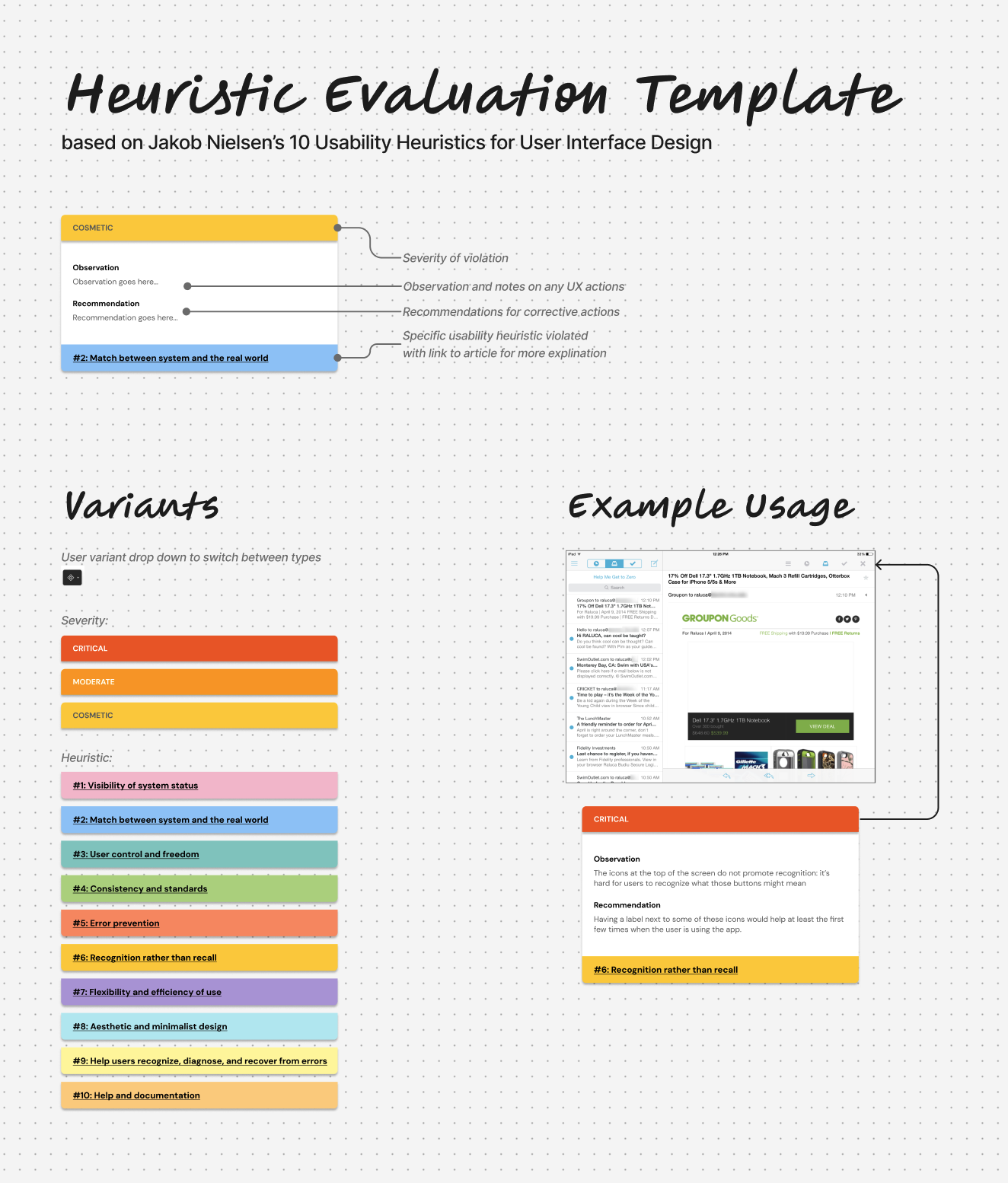
One year later, I did a more comprehensive design audit for the creation of a new interface for the verification system based on existing workflows in the old, core web application. For this design audit, I used Jakob Nielsen’s 10 usability heuristics as a rubric. And I used FigJam to capture my findings and recommendations while pointing them to the exact issue areas in screenshots of the application.
Product Discovery
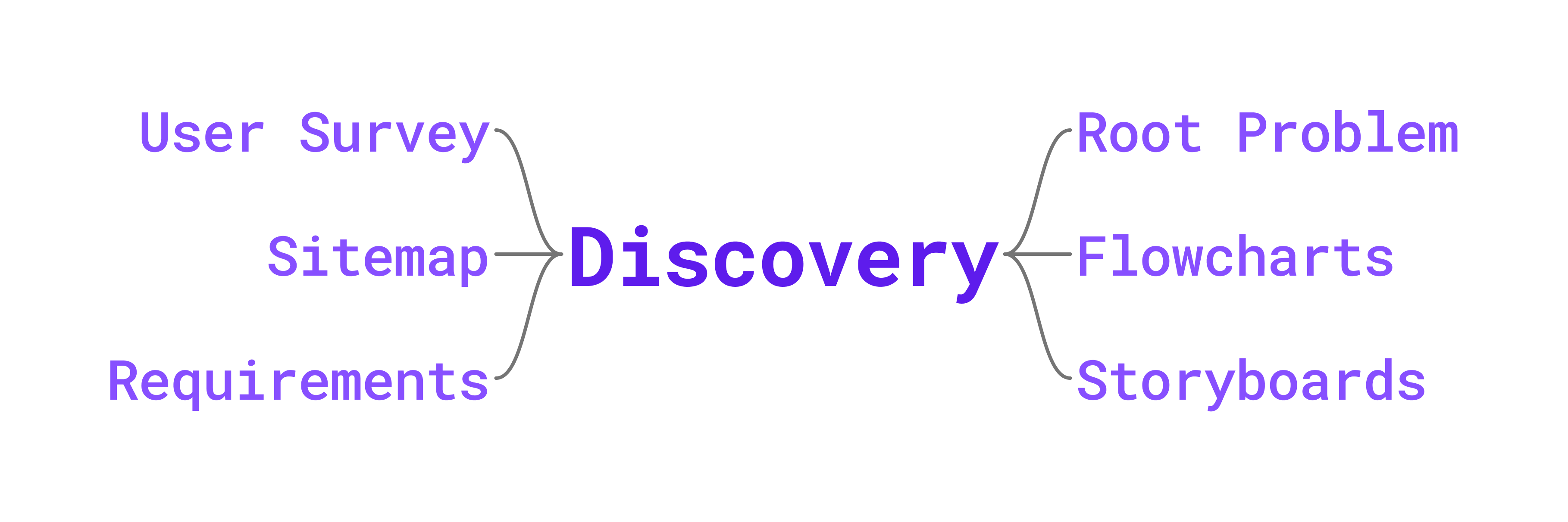
The design and development of the newest interface was allotted at least 6 months of discovery. I created a UX/UI design proposal with a timeline for carrying out different UX research methods:
- Develop a root problem questionnaire for the client to determine the core goals and needs for the interface
- Create flowcharts of existing workflows with client to understand current process
- Create flowcharts of newly, modified workflows with client to improve the process
- Generate storyboards of each user role that reflects their experiences and emotions to uncover pain points
- Design and execute a user survey plan for each user role to obtain direct input on pain points and suggestions
- Create the information architecture for the new interface based on outcomes of the UX research
- Write requirements for UI design, data, and development to conclude product discovery
Other Projects
Project Highlights
I worked on a handful of other projects for clients in the nonprofit and government realms. The design work included a mix of wireframes, mocks, audits, and tailoring UX research methods.
Usability Report
A client requested a usability report for their web application that helps high school students and adults build resumes, find jobs, and explore careers. First, I led a team design audit to obtain insights from team members. Second, I conducted a partial accessibility test with manual and automated tests on the primary application screens. Finally, I organized moderated usability testing (including money incentives) with current users of the application. My team member created a supplementary data report. In the final usability report, I highlighted what worked well on the application, primary issues determined from the UX research, and suggestions for improving the UX/UI of the application as well as enhancing support for their communities.
Knowledge Base Support
One of the next phases for the homeless management project was to set up a knowledge base. Once a platform was selected, I worked on a team of three to plan out the knowledge base. I created a style guide for articles and a custom checklist for meeting accessibility guidelines. I also edited the knowledge base’s portal customization to modify navigation and add elements to article templates.
Green River
Work Summary
Summary of Work
During my time at Green River, I worked as a UX/ UI Generalist with a specialization in UX Research and UX Strategy. Majority of my time was spent designing wireframes, mocks, and prototypes. But I most enjoyed incorporating and tailoring UX methods to different projects: comprehensive design audits, creating flowcharts for existing and new workflows, storyboarding, developing survey plans, and more.
Employment Duration: December 2022 - Decembre 2025
Public Health Tracking Network
Project Summary
Client: Delaware Health & Social Services
Project: My Healthy Community Website
My Health Community is an environmental public health tracking networking website for the state of Delaware. Visitors primarily used it to view COVID-19 data. The website hosted data for several other health and environment topics: infectious diseases, climate, chronic diseases, mental health, and more. Each topic page had interactive data visualizations to help interpret the data: charts, maps, KPIs, and data tables. There was a dedicated area to find and download data used on the site. Depending on the datasets, there was also data available for counties, ZIP codes, census tracts, and more.
Project Highlights
My role on this project was to support the redesign and upgrade of every page on the website. Most topic pages either required initial client specifications or basic design improvements. But I also designed new dashboards and new features/tools for the site in collaboration with the PM, tech lead, devs, and data analysts. For UX research, I created user feedback surveys in Hotjar and analyzed user data in Google Analytics. I embedded design best practices regarding typography, spacing, and colors to establish a more consistent and cohesive website.
Homepage
With the redesign of the homepage, I had more freedom with modifying the content and layout as well as implementing more UX research methods. I started with doing a comparative analysis of homepages on other public health tracking network websites. Then I reviewed the user data for the homepage and other key areas of the site through Google Analytics and Hotjar (which has heatmaps and screen recordings). With those outcomes, I brainstormed design improvements and created 2-3 versions of wireframes and mocks for client review before finalizing the designs for development.
Key Changes
- Reduced the number of featured cards to include other content above the fold
- Moved the topic categories closer to the top for better visibility and engagement
- Created a new tab component for toggling between topic categories
- Added steps and user guidance to the component for selecting a topic and location
Changing Topics & Locations
I also had free reign when redesigning the tool used to change topics and locations. This tool can be accessed directly from the homepage or as a pop-up window from any other page on the site, and it has become a signature part of My Healthy Community. I insisted that the updated tool have multiple ways for changing locations for users to choose their preference: a visual map, a dropdown list, a shortcut to selecting the state level, or a list of the most populated regions. The challenge was getting all of the selection options to fit nicely within a limited space. I redesigned the tool by creating a complex prototype in Figma using variables to capture the various interactions and behaviors of the tool.
Data Story
The client had published a report on heat-related illnesses in the state of Delaware and requested a design for a new data story to appear on the site. Since the content already existed, my focus was on the interactive behavior of the data story. I did another comparative analysis on data stories from other public health related and news reporting sites. From there, I designed a data story in Figma with the following key experiences and behaviors:
- Spacious content to help tell the story one section at a time
- Simple visual animations to enhance the storytelling effect
- Seamlessly scroll through data visualizations to reduce overwhelming users with data
- Ways to click between data visualizations instead of solely depending on scrolling
- Options to view data tables for each data visualization
- User guidance for interacting with data visualizations
Coffee Supply Chain Verification System
Project Summary
Client: Starbucks & Scientific Certification Systems (SCS) Global Services
Project: Verification web application
This complex verification system is composed of a 20-year-old, visually-outdated core web application plus newly developed interfaces to handle different stages of the extensive coffee supply chain verification process: application submission, inspection, verification, correction, and approval. Three of the interfaces were still in design and development. Since this is a private project, I can only describe the design process I used and share project information that is publicly available.
Project Highlights
I worked on designs for the remaining pages needed for the new interfaces and updated the design system in Figma. On rare occasions, I had to create designs to match the old core application and redesign a PDF report.
Design Audits
The new interfaces had several UX & UI inconsistencies due to lack of design priority and the number of different developers working on the project. I conducted a basic design audit for all the new interfaces that targeted the noticeable inconsistencies: navigation, headings, modals (confirmation windows), iconography, and tables. I proposed design recommendations and created tickets for developers to create shared components.
One year later, I did a more comprehensive design audit for the creation of a new interface for the verification system based on existing workflows in the old, core web application. For this design audit, I used Jakob Nielsen’s 10 usability heuristics as a rubric. And I used FigJam to capture my findings and recommendations while pointing them to the exact issue areas in screenshots of the application.
Product Discovery
The design and development of the newest interface was allotted at least 6 months of discovery. I created a UX/UI design proposal with a timeline for carrying out different UX research methods:
- Develop a root problem questionnaire for the client to determine the core goals and needs for the interface
- Create flowcharts of existing workflows with client to understand current process
- Create flowcharts of newly, modified workflows with client to improve the process
- Generate storyboards of each user role that reflects their experiences and emotions to uncover pain points
- Design and execute a user survey plan for each user role to obtain direct input on pain points and suggestions
- Create the information architecture for the new interface based on outcomes of the UX research
- Write requirements for UI design, data, and development to conclude product discovery
Other Projects
Project Highlights
I worked on a handful of other projects for clients in the nonprofit and government realms. The design work included a mix of wireframes, mocks, audits, and tailoring UX research methods.
Usability Report
A client requested a usability report for their web application that helps high school students and adults build resumes, find jobs, and explore careers. First, I led a team design audit to obtain insights from team members. Second, I conducted a partial accessibility test with manual and automated tests on the primary application screens. Finally, I organized moderated usability testing (including money incentives) with current users of the application. My team member created a supplementary data report. In the final usability report, I highlighted what worked well on the application, primary issues determined from the UX research, and suggestions for improving the UX/UI of the application as well as enhancing support for their communities.
Knowledge Base Support
One of the next phases for the homeless management project was to set up a knowledge base. Once a platform was selected, I worked on a team of three to plan out the knowledge base. I created a style guide for articles and a custom checklist for meeting accessibility guidelines. I also edited the knowledge base’s portal customization to modify navigation and add elements to article templates.
Green River
Work Summary
Summary of Work
During my time at Green River, I worked as a UX/ UI Generalist with a specialization in UX Research and UX Strategy. Majority of my time was spent designing wireframes, mocks, and prototypes. But I most enjoyed incorporating and tailoring UX methods to different projects: comprehensive design audits, creating flowcharts for existing and new workflows, storyboarding, developing survey plans, and more.
Employment Duration: December 2022 - December 2025
Public Health Tracking Network
Project Summary
Client: Delaware Health & Social Services
Project: My Healthy Community Website
My Health Community is an environmental public health tracking networking website for the state of Delaware. Visitors primarily used it to view COVID-19 data. The website hosted data for several other health and environment topics: infectious diseases, climate, chronic diseases, mental health, and more. Each topic page had interactive data visualizations to help interpret the data: charts, maps, KPIs, and data tables. There was a dedicated area to find and download data used on the site. Depending on the datasets, there was also data available for counties, ZIP codes, census tracts, and more.
Project Highlights
My role on this project was to support the redesign and upgrade of every page on the website. Most topic pages either required initial client specifications or basic design improvements. But I also designed new dashboards and new features/tools for the site in collaboration with the PM, tech lead, devs, and data analysts. For UX research, I created user feedback surveys in Hotjar and analyzed user data in Google Analytics. I embedded design best practices regarding typography, spacing, and colors to establish a more consistent and cohesive website.
Homepage
With the redesign of the homepage, I had more freedom with modifying the content and layout as well as implementing more UX research methods. I started with doing a comparative analysis of homepages on other public health tracking network websites. Then I reviewed the user data for the homepage and other key areas of the site through Google Analytics and Hotjar (which has heatmaps and screen recordings). With those outcomes, I brainstormed design improvements and created 2-3 versions of wireframes and mocks for client review before finalizing the designs for development.
Key Changes
- Reduced the number of featured cards to include other content above the fold
- Moved the topic categories closer to the top for better visibility and engagement
- Created a new tab component for toggling between topic categories
- Added steps and user guidance to the component for selecting a topic and location
Changing Topics & Locations
I also had free reign when redesigning the tool used to change topics and locations. This tool can be accessed directly from the homepage or as a pop-up window from any other page on the site, and it has become a signature part of My Healthy Community. I insisted that the updated tool have multiple ways for changing locations for users to choose their preference: a visual map, a dropdown list, a shortcut to selecting the state level, or a list of the most populated regions. The challenge was getting all of the selection options to fit nicely within a limited space. I redesigned the tool by creating a complex prototype in Figma using variables to capture the various interactions and behaviors of the tool.
Data Story
The client had published a report on heat-related illnesses in the state of Delaware and requested a design for a new data story to appear on the site. Since the content already existed, my focus was on the interactive behavior of the data story. I did another comparative analysis on data stories from other public health related and news reporting sites. From there, I designed a data story in Figma with the following key experiences and behaviors:
- Spacious content to help tell the story one section at a time
- Simple visual animations to enhance the storytelling effect
- Seamlessly scroll through data visualizations to reduce overwhelming users with data
- Ways to click between data visualizations instead of solely depending on scrolling
- Options to view data tables for each data visualization
- User guidance for interacting with data visualizations
Coffee Supply Chain Verification System
Project Summary
Client: Starbucks & Scientific Certification Systems (SCS) Global Services
Project: Verification web application
This complex verification system is composed of a 20-year-old, visually-outdated core web application plus newly developed interfaces to handle different stages of the extensive coffee supply chain verification process: application submission, inspection, verification, correction, and approval. Three of the interfaces were still in design and development. Since this is a private project, I can only describe the design process I used and share project information that is publicly available.
Project Highlights
I worked on designs for the remaining pages needed for the new interfaces and updated the design system in Figma. On rare occasions, I had to create designs to match the old core application and redesign a PDF report.
Design Audits
The new interfaces had several UX & UI inconsistencies due to lack of design priority and the number of different developers working on the project. I conducted a basic design audit for all the new interfaces that targeted the noticeable inconsistencies: navigation, headings, modals (confirmation windows), iconography, and tables. I proposed design recommendations and created tickets for developers to create shared components.
One year later, I did a more comprehensive design audit for the creation of a new interface for the verification system based on existing workflows in the old, core web application. For this design audit, I used Jakob Nielsen’s 10 usability heuristics as a rubric. And I used FigJam to capture my findings and recommendations while pointing them to the exact issue areas in screenshots of the application.
Product Discovery
The design and development of the newest interface was allotted at least 6 months of discovery. I created a UX/UI design proposal with a timeline for carrying out different UX research methods:
- Develop a root problem questionnaire for the client to determine the core goals and needs for the interface
- Create flowcharts of existing workflows with client to understand current process
- Create flowcharts of newly, modified workflows with client to improve the process
- Generate storyboards of each user role that reflects their experiences and emotions to uncover pain points
- Design and execute a user survey plan for each user role to obtain direct input on pain points and suggestions
- Create the information architecture for the new interface based on outcomes of the UX research
- Write requirements for UI design, data, and development to conclude product discovery
Other Projects
Project Highlights
I worked on a handful of other projects for clients in the nonprofit and government realms. The design work included a mix of wireframes, mocks, audits, and tailoring UX research methods.
Usability Report
A client requested a usability report for their web application that helps high school students and adults build resumes, find jobs, and explore careers. First, I led a team design audit to obtain insights from team members. Second, I conducted a partial accessibility test with manual and automated tests on the primary application screens. Finally, I organized moderated usability testing (including money incentives) with current users of the application. My team member created a supplementary data report. In the final usability report, I highlighted what worked well on the application, primary issues determined from the UX research, and suggestions for improving the UX/UI of the application as well as enhancing support for their communities.
Knowledge Base Support
One of the next phases for the homeless management project was to set up a knowledge base. Once a platform was selected, I worked on a team of three to plan out the knowledge base. I created a style guide for articles and a custom checklist for meeting accessibility guidelines. I also edited the knowledge base’s portal customization to modify navigation and add elements to article templates.